Exercise 3 and 4: Prototypes, Finishing and Reflection
Prototype 1 Sketches:


Explanation: Prototype 1
- Square shaped breakfast set
- design 2 spider webs on the top and on the opening area a design of a spider
- Experimented with colour (red and black)
- Used cardboard to create prototype
- Ingredients list
- Normal opening box
- Cardboard egg and cardboard onigiri
Prototype 2 Sketches:


Explanation: Prototype 2
- Circular box
- Spider design on the top
- Bottom of box has spider web with 2 small spiders
- ingredients list
- remove the top of the lid by bringing it up
- used manila cardboard and normal cardboard
- used tape and stapler to secure the manila cardboard together to make it stay round
- cardboard onigiri and cardboard egg
Reflection Prototype 2 = Ive realised that making the box circular would be quite hard and I believe it'd be easier for consumers to use a square box as they can securely hold it better without needing to carry it with 2 hands at the same time and possibly decrease the likelihood of a person dropping the breakfast set. Not enough food, no variety, will place more variety for the food the breakfast set contains.
Prototype 3 Sketches:


Explanation: Prototype 3
Slide in and out box concept for easy access.
The designs on the top of the box and the sides are spider man themed design to suit the media franchise.
The spider’s body is used to puncture in and place a drink in it securely.
The gap at the back of the box allows you to place the spider’s body that gets cut out from placing the drink in, it then allows you to lean your phone onto it without it falling.
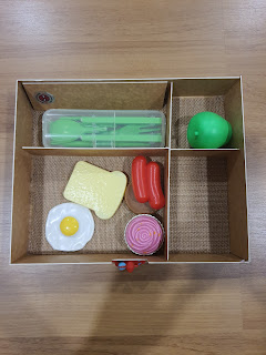
Divider inside to separate the food.
- Contains bread, egg, grapes, sausages for a well round on the go breakfast meal


Explanation: Finishing Product
- Slide in and out concept
- Used black coloured thread to create the spider webs on the top of the breakfast set for design
- cut out and coloured in spider and pasted it on the top of the breakfast set
- pasted logo onto top of container
- placed in a type of net that is placed at the bottom of the box that contains the food to ensure the food stays warm for a long period of time
- placed dividers in the food box to separate different food from each other and make it more organised
- pasted spider man figure at the opening of the breakfast set to support the media franchise, spider-man
- placed a top layer on top of the box that contains the food to prevent any foreign particles from entering the food
REFLECTION:
- Brand name we chose lacked creativity, shell's name was still very prominent on the new brand name which causes a decrease in new brand identity.
What I was testing on making this product:
- Shapes of container
- Design on container
- Ingredient list
- Compartment in container
- How to make the food stay warm
Comments
Post a Comment